Table of Contents
Using Percentages
If you’re traditionally using pixels, your boxes or images will have a fixed size. For example, if you have a really large image embedded on you site, it might look good on a big screen, but, if you see the same image on a smartphone, the image falls off the screen. It looks odd!
So for an example, if you have an image inside a div class of ‘img‘, set the width to percentage rather than pixel :
.img {
     width: 80%;
}
Changing the width property from pixel to percentage makes the image responsive. This hack always works only inside it’s parent container/div. Percentages are always relative to their parents.
Always use width or height properties and not both as it might distort the image rather than making the image responsive.
Max-Width and Min-Width Property
It’s a very important CSS property when it comes to responsive web design layout. So, what this property does is that when the screen size is very big, the div or the container where the property is applied stops growing beyond the max-width which you’ve set.
The min-width on the other hand does the exact opposite. It locks the screen ‘zoom-out’ ratio beyond a given point and hence, your website works responsively on all screen sizes. Here’s an example :
.container-one {
   min-width: 200px;
   max-width: 800px;
}
Note: If the content is smaller than minimum width, then min-width activates. If the content is larger than maximum width, then max-width activates. They cannot become smaller than min-width and larger than max-width. In all other cases the default set values remain.
em and rem units
1. em
Firstly, note that em’s are relative to their parents’ font size. So, if we say font-size : 1em it means the parent’s font size X 1. Example :
.box-one {
font-size: 3em;
}
It’s very handy. So, if you change the property in the parent container (which is in pixel), it changes the font-size in the child container (which is in em) automatically. Saves a lot of work!
2. rem
rem is basically root em. Which means, it comes from the root of the HTML document. So, the font size is now relevant to the root of the HTML document. Here’s how :
html {
   font-size: 25px;
}

.container-One {
   font-size: 1.5rem;
}
However, you don’t have to set the html font size. You can use rem’s of itself, standalone. And that’s the best part.
Recommended : Use em’s for padding/margin and rem’s for font-size for better results. Use em’s or percentage also for width. However, that’s not a rule book to follow, you can use your own suitable styles as well.
Using CSS Flexbox
Keep in mind the fact that by default, HTML elements have a display: block or display: inline property already set by the browser. Block elements (like h1, h2,p, div, header, footer, etc.) stack on top of each other. Also a, em, span, strong etc. which are inline elements also behave according to what’s around them (like their div or parents).
To change the stacking behaviour we always use display: flex CSS property in the parent container after which this happens :

So, previously the child containers were stacking on top of each other vertically. But after applying display-flex, they stack horizontally.
Column Spacing Flexbox items horizontally
There are basically three CSS rules to space the flexbox items. Here they are :
.parent-div {
     justify-content: space-between;
}


.parent-div2 {
    justify-content: space-around;
}


.parent-div3 {
     justify-content: space-evenly;
}
These CSS properties are very useful for creating blocks and sidebars for your website. These are good for spacing things out on the main axis (horizontal axis).
Flexbox align-items property
This property works vertically. It spaces things out on the cross axis (vertical axis). So, the properties are as follows :
parent-div {
   align-items: flex-start;
}

/* aligns items on the top of the flexbox */

parent-div {
    align-items: center;
}

/* aligns items on the center vertically */

parent-div {
    align-items: flex-end;
}

/* aligns items at the bottom vertically */

parent-div {
     align-items: stretch;
}

/* default */

parent-div {
    align-items: baseline;
}

/* property set based on the first line of text for each child container (the bottom of text basically) */
Media Queries
Understanding media queries is one of the most important things in order to build a responsive layout which works on all screen sizes. What media query does is that it adds new styles or behavior to your website under certain specific conditions.
Here’s the simple basic syntax to start with :
@media media-type and (media-features/conditions) {
// your CSS code goes here
}
1. CSS Media Type
We have different values here which targets different types of media :
- Screen (targeting screens like phones, monitors, tabs specifically)
- All
- Print (for printing)
- Speech (screen reading/ reading pages aloud)
2. CSS Media Features/Conditions
It targets certain specific conditions within a CSS media-type. Examples :
- Orientation
- Width and height
- Hover, resolution, colors etc.
Don’t get confused by the name. It’s either called media-features or media-conditions. Sometimes they are also called expressions.
Note: You can either use CSS media-type or media-features inside your projects. You don’t have to use both of them together every time. It’s optional.
Get to know all the media-types and features in details by clicking here.
How to Combine both Media-Type and Media-Feature
In order to combine both of them, you have to use and keyword like so :
@media screen and (min-width: 720px) {
// CSS code here
}
Some Examples of Media Query
@media (min-width: 500px) and (max-width: 1920px) {
  body {
    background-color: red;
  }
}

/* Here the background changes to red in between the max and min widths */
@media (min-width: 720px) {
body {
background-color: pink;
}
}
/* Background color changes to pink when the screen width touches at least 720px */Note: If you have two similar media-queries applied on the same HTML tag, the latest one, i.e., query code further down inside your CSS file gets the priority.
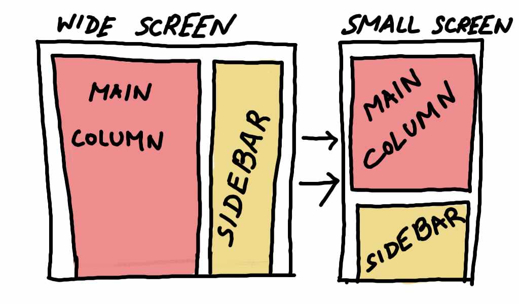
Changing flex-direction using Media Query to make responsive layouts
This is a very useful and interesting hack. As you know that the default flex-direction property is set to row. Keeping this in mind, you can set the sidebar in a website to go horizontal or vertical according to the size of the screen.
Let’s now see this in action using a code example :
.sidebar-1 {
   display: flex;
}

@media (max-width: 500px) {
   .sidebar-1 {
       flex-direction: column;
    }
}
This sketch shows what the above code does:
Here’s another example to showcase flex-direction and Media Query working together to make a website layout which works on both PC and mobile:
.all-boxes {
    display: flex;
}

@media (max-width: 720px) {
   .all-boxes {
       flex-direction: column;
   }
}

.box-A {
   width: 20%;
}

.box-B {
   width: 20%;
}

.box-A {
   width: 60%;
}

.box-B {
   width: 60px;
}

@media (max-width: 720px) {
   .box-A,
   .box-B,
   .box-C {
       width: 100%;
   }
}
This is what the above code does:

As you can see in the diagram above, we’re first using a media-query to change the direction of the flex item to column, then 20% area is allocated to Box-A and Box-B each, and, for Box-C we’ve allocated 60% to fill up the rest of the horizontal width. Next, for the mobile device we’ve used another media-query to to fill up the whole 100% width for all the boxes. So, now the boxes stack on top of each other.
The flex-wrap property
This CSS property is not very talked about, but this property automatically makes the flex items mobile responsive if you use it inside the parent container which has two or more child containers.
As the screen size shrinks, the child containers stack vertically along the cross axis. As the screen size grows, the child container lines up horizontally along the main axis. Here’s the code :
parent-container {
  display: flex;
  flex-wrap: wrap;
}